Simplify Slides

Keep C.A.L.M and Simplify Slides
Accessibility is fundamentally about making sure people can access the content you create. As part of our Choose Accessible Learning Materials (CALM) campaign, we invite university community members to apply best practices of digital accessibility and make their presentation slides accessible. Simplifying slides creates a welcoming and inclusive experience for everyone in the audience. Plus it’s part of university policy (and the law). Read on to learn more about best accessibility practices to simplify your slides that enable inclusion.
Why Simplify Slides
It is necessary to make sure that everyone in your audience can acquire the same information, engage in the same interactions, and enjoy the same experiences.1 When you present or teach, ensuring your slides are simple and accessible means that your entire audience is going to be able to fully engage with and learn from the content you are creating. The essential practices to make your slides simple and accessible include using templates or built-in layouts, selecting easy to read fonts, checking color contrast, Including alternative text, captioning videos, using meaningful links, and avoiding content that looks like tables.
Tell Me How
Accessibility Checker
Using the accessibility checker in PowerPoint and Grackle for Google Slides is a great first step while you're creating your presentation. Accessibility checker tools offer options to fix identified issues, but may not catch all accessibility problems. We’ve gathered the best practices below as a guide to help you identify common accessibility issues in presentations.
Design Best Practices
Use templates or built-in layouts
- Use an accessible slide deck master template (see below) or built-in preset slide layouts provided by the application you use (Google Slides or Powerpoint).
- Do not repeat slide titles.
- Minimize the amount of text on slides.
- Use simple, non-automatic transitions between slides.
Select easy to read fonts
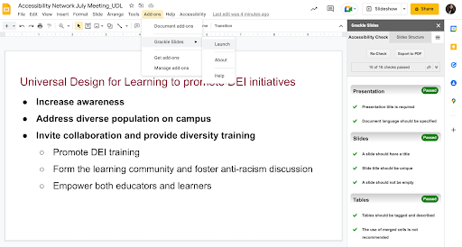
Format text with titles, headings, and other built-in styles to enhance readability and improve the structure of the slides. See the following example of one Google slide.

- Use a sans-serif font (i.e., Arial, Verdana, Helvetica) with a standard size of 24 pt and never go below 18 pt. Remember that a room that seats more people may need bigger type for those in the back rows.
- Provide adequate line spacing (minimum 1.15) and avoid forced justification.
- Avoid using only color as the only visual separator of content (i.e., green/red).
- Use italic and bold to highlight content instead of underlining.
- Avoid using ornate, very thin, or condensed typefaces.
- Avoid flashing and blinking text.
Check color contrast
- Check contrast between text and background to be sure the content can be easily viewed.
- When using Virginia Tech brand colors, this means no maroon text on black, no orange text on maroon, or maroon text on orange. Use only Burnt Orange Web-Digital on white.
- Avoid watermarks (screened images under type) and background images.
Include alternative text
- Include alternative text for graphics and images that explain why they are meaningful.
- If words are in an image, they must be in the alternative text.
- Limit the use of decorative elements, and if used, label them as decorative in the alternative text pane.
Caption videos
- Make sure that videos are captioned and audio described.
Use meaningful links
- If hyperlinks are included use meaningful links.
- Avoid using “click here” or similar phrases.
Avoid tables
- Display information in a linear format instead of as a table when possible.
- If tables are needed, provide a title, summary description, and label the tables’ header rows and columns.
File Sharing Best Practices
- Ensure that each PowerPoint slide has the correct reading order by using the Accessibility Checker in the Review ribbon menu.
- Provide both a native version of the presentation and the PDF version. There are advantages to each so let the user decide.
- Export from PowerPoint in an alternate format such as PDF or Rich Text Format. For Google Slides, use Download to get other formats.
Presentation Delivery Best Practices
- When you advance a slide, pause to let people read it before speaking.
- Describe images on slides (giving voice to images used).
- For presentation to a large audience, ensure the question and answer period is accessible. If there is a microphone for questioners, make sure they use it. Also, repeat the questions so everyone can hear them.
- Before playing a video give a brief description of the content. This will help all audience members, especially those who are blind to establish context for what they will hear.
- Monitor your audience's behavior and offer accommodations as needed. For example, ask for an adjustment to microphone volume, or to room lighting.
Need help? Request a consultation with a TLOS Accessible Technologies team member.
Join the Campaign
By applying accessibility practices to slides for various learning environments, our goal is to promote inclusion through increased awareness of accessibility practices and its implementation. You can help us get there by sharing links to your slides on Twitter @VT_TLOS #CALMSimplifySlides or emailing links or screenshots to assist@vt.edu. Every entry is eligible for some of our Keep C.A.L.M swag.
Resources
- 2022 Virginia Tech Accessible Slide Deck Template (PPTX | 30.4 MB)
- Accessible slides presentation (PPTX | 1.1 MB)
- How can you make your presentation accessible?
- WebAIM PowerPoint Accessibility article
- Microsoft Office PowerPoint Accessibility documentation
- Tips for creating and delivering an effective presentation
- Understanding PowerPoint Accessibility
- Checking the Reading Order of the Slides
- Joint Letter US Department of Justice and US Department of Education
- SBCTC’s Library of Accessibility Resources
- Keep C.A.L.M. and Simplify Slides Poster (PDF | 3.6 MB)
Related Workshops
- TLOS Professional Development Network Inclusive Practices workshops
- IAAP Self-Paced Course - Document Accessibility (This workshop is available at no charge to Virginia Tech employees that request an IAAP membership.)
Based on the definition of accessibility indicated in the Joint Letter US Department of Justice and US Department of Education in 2010


